Case study
Jonathan Zalzman Guitar
A website for a guitar teacher and working musician in Suwanee, Georgia. The goal of the site is to get visitors to book a free trial lesson.
- Client
- Jonathan Zalzman (Suwanee, Georgia, US)
- My role
- Design and development
- Year
- 2026
- Hand-codedHTML, CSS and JavaScript, no page builder or plugins
- Two audiencesAdult players and parents, each given their own section on one page
- One booking formEvery call to action on the page leads to it
About the project
Jonathan teaches guitar, bass and ukulele in Suwanee, Georgia and online, and he performs regularly. The site is built around that. The headline is "Learn guitar from a working musician", and the design and copy are meant to make that clear right away and then make booking a lesson easy.
The design uses performance photos on a dark background so the site looks like a musician's site. The nine styles he teaches (rock and blues, funk, jazz and fusion, prog and shred, metal, theory and ear training, bass and ukulele, songwriting, improvisation) each have a short description. Three five-star reviews from students of different ages are placed where a parent or an adult beginner would be deciding.
Pricing is shown on the page: the first lesson is free, then 30 or 60 minute lessons at a flat rate, with no registration fee, contract or subscription. The booking form asks for the instrument, experience level and whether the lessons are in person or online. Every call to action on the page links to the form, and his phone number and email are also shown.
The site is hand-coded HTML, CSS and JavaScript hosted on Netlify. There is no page builder and there are no plugins to update.
Section by section
The page, top to bottom.
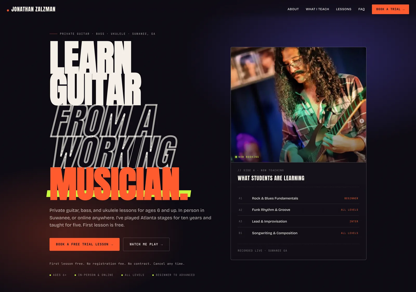
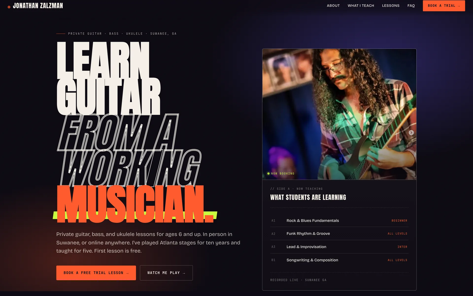
Header and heroA condensed headline in orange and white, a stage photo, and a card that lists what students are learning right now. The two buttons are the only two things a visitor can do: book a free trial or watch him play. 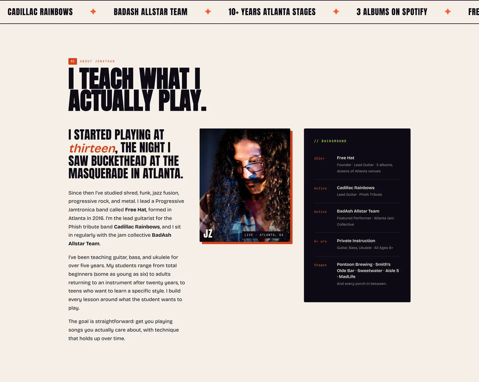
Ticker and bioA scrolling ticker with the bands and the numbers (10+ years on Atlanta stages, 3 albums on Spotify), then a light section with his story in his words, a photo and a credentials card. The light background gives the eye a rest after the dark hero. 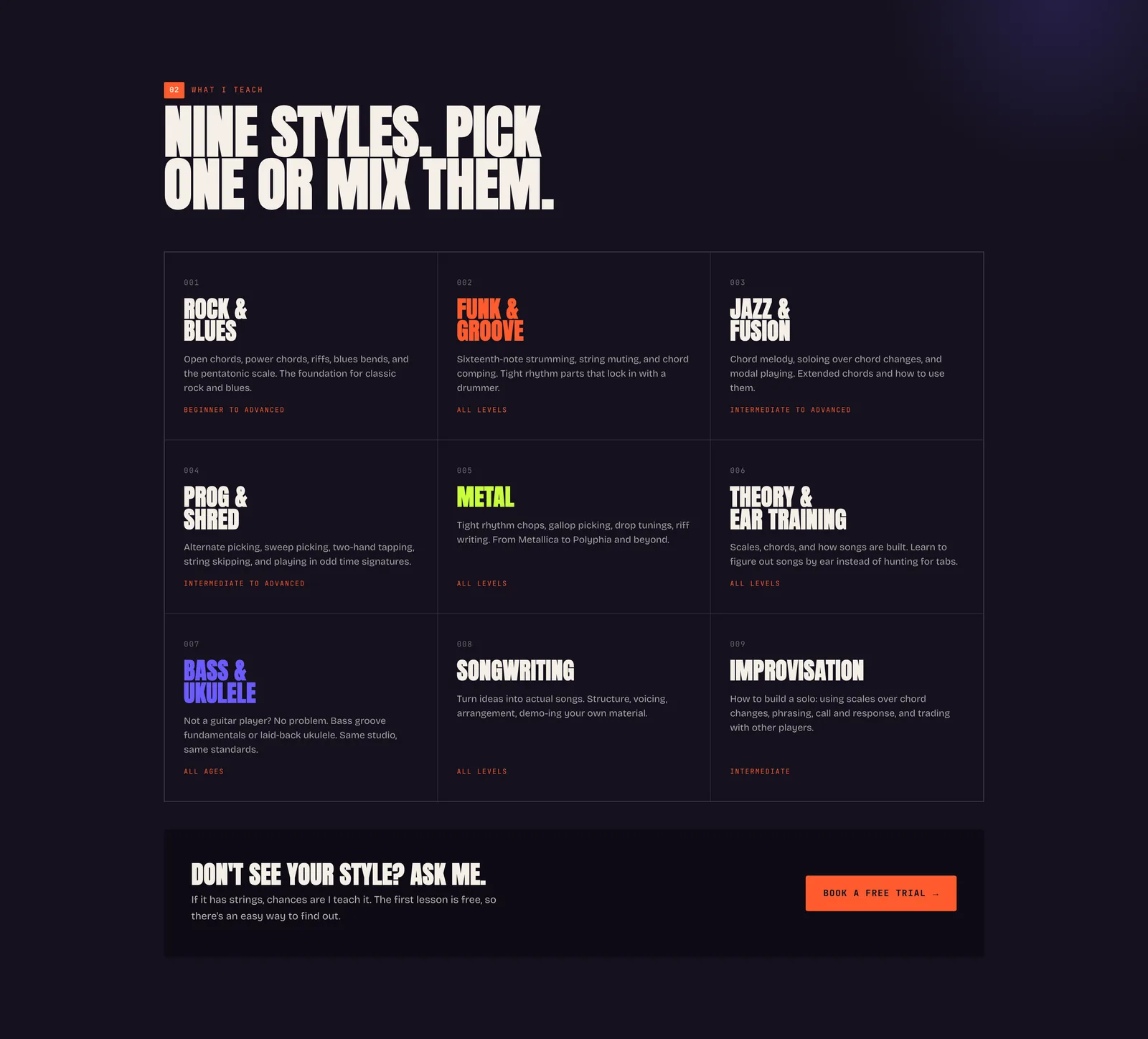
Nine stylesA three-by-three grid, each style in its own color with two lines of copy. Under it, a bar for the visitor whose style is not listed, with the trial button again. 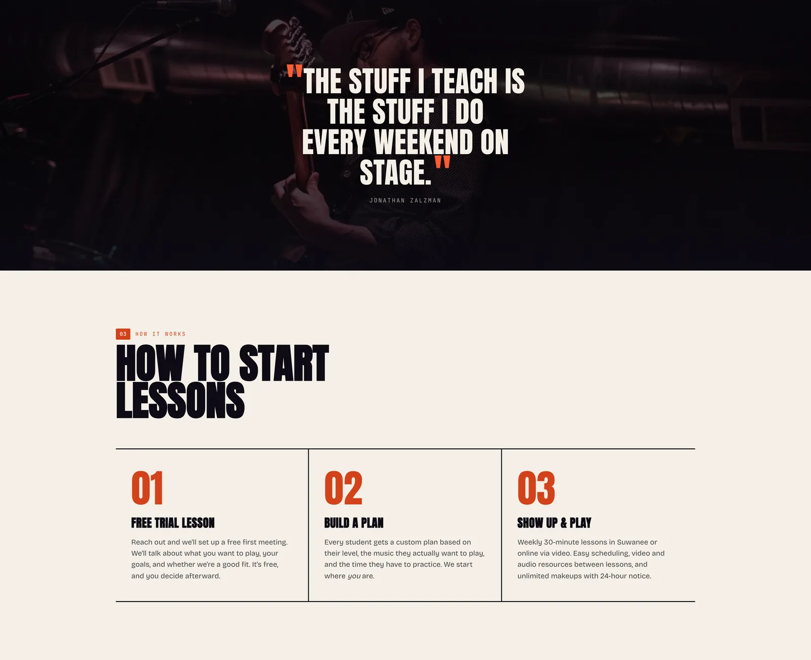
Quote and three stepsA full-width stage photo with one quote over it, then the three numbered steps to start: a free trial lesson, a plan, then showing up and playing. 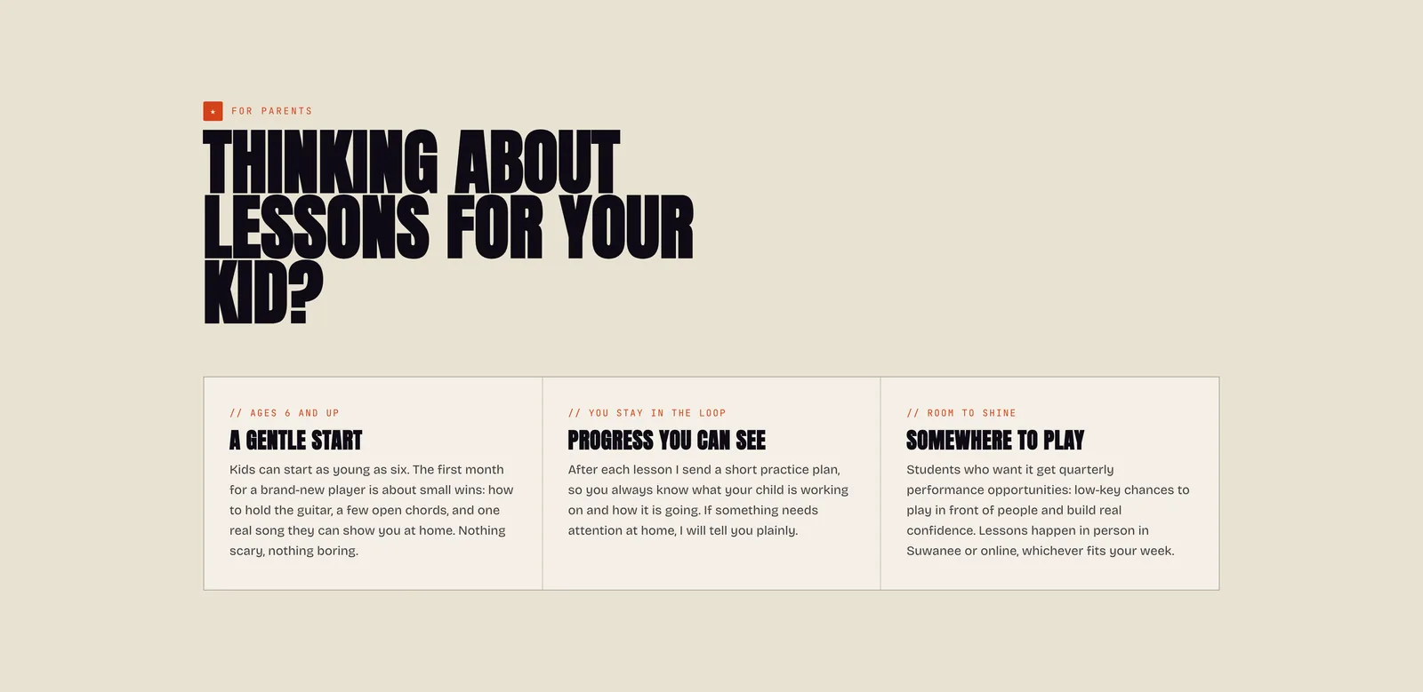
For parentsThree short answers for a parent deciding for a kid: a gentle start, progress you can see, somewhere to play. Parents are half the audience, so they get their own section. 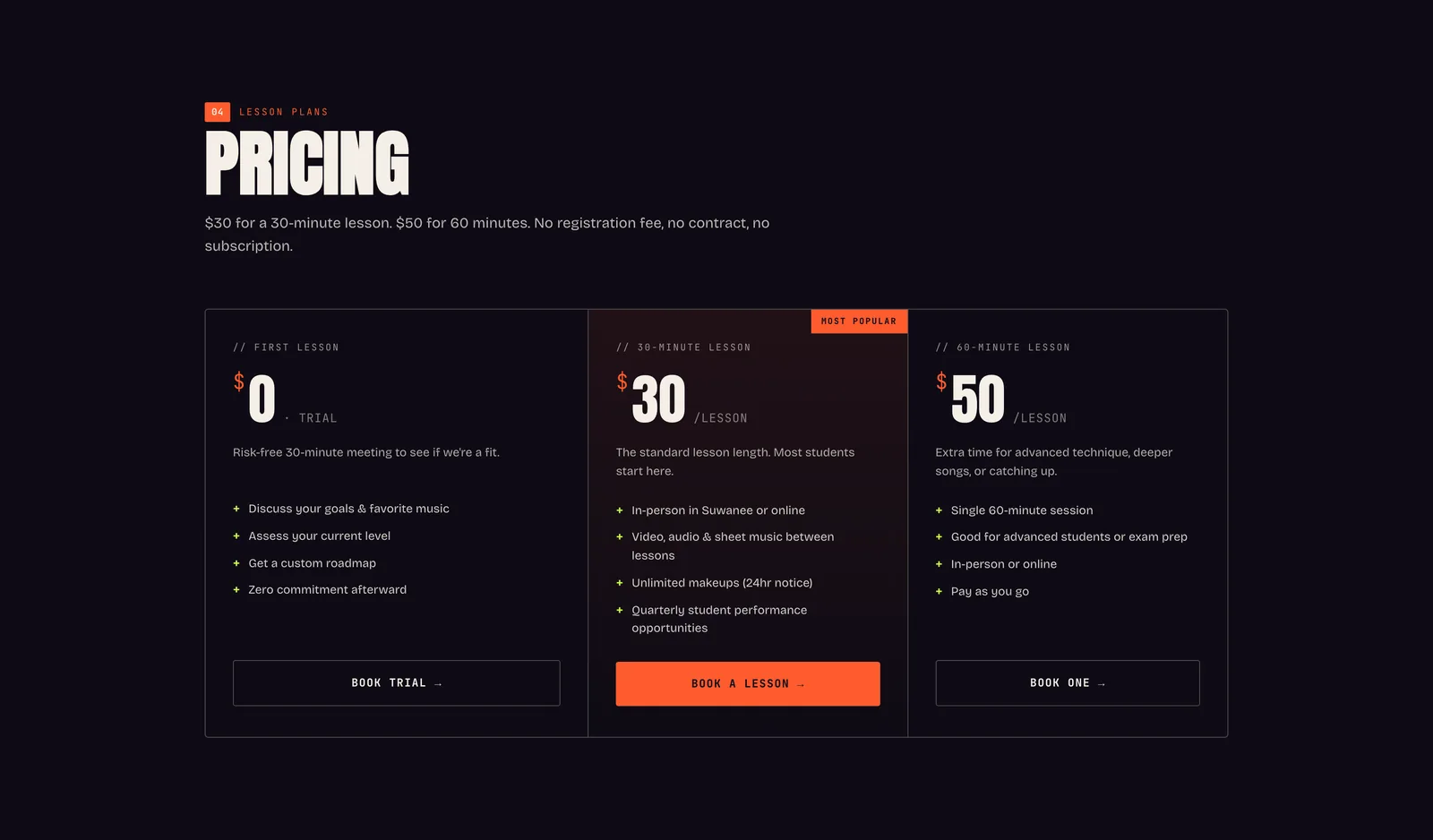
PricingThree cards: the free first lesson, 30 minutes and 60 minutes, each with what is included and a button. A line above the cards says there is no registration fee, contract or subscription. 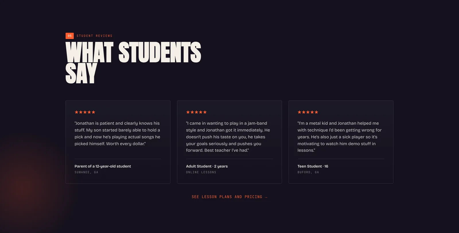
Student reviewsThree five-star reviews from students of different ages, each with who they are (a parent, an adult beginner, a teenager). 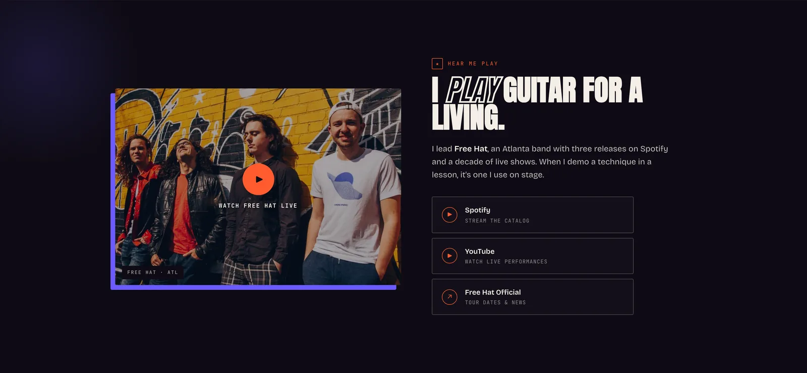
I play guitar for a livingA band photo and three links: Spotify, YouTube and his band Free Hat. It lets a visitor hear him play before booking a lesson. 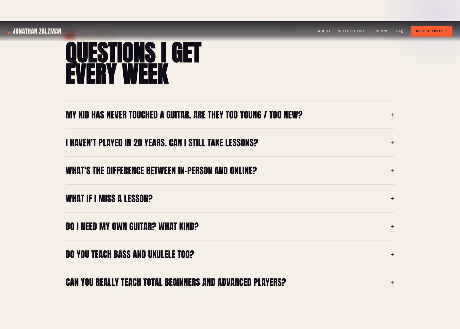
Common questionsSeven questions in an accordion: is my kid too young, I have not played in 20 years, do I need my own guitar, what happens if I miss a lesson. These are the questions that otherwise arrive one at a time by email. 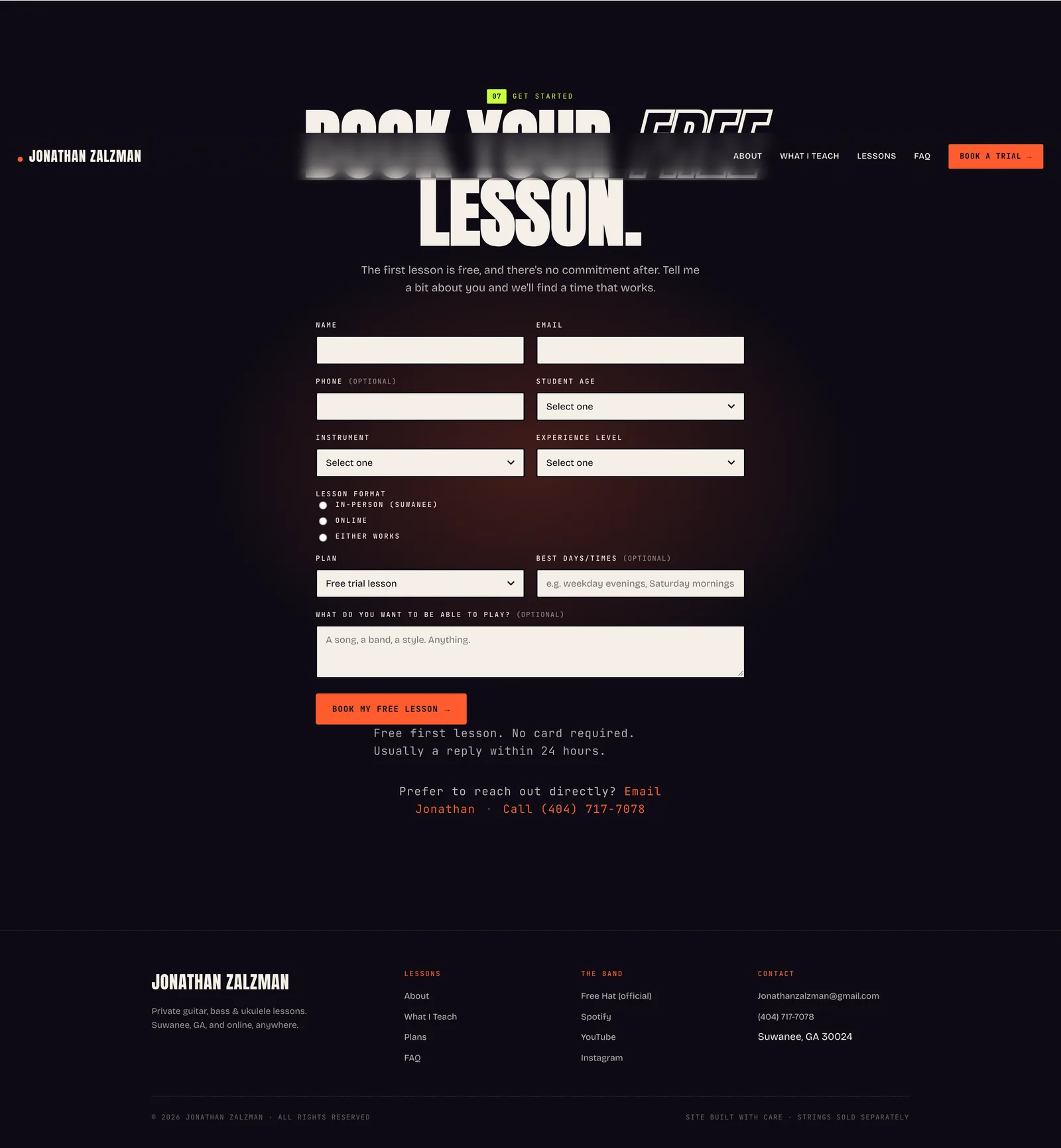
Booking form and footerThe booking form asks for the instrument, the student age, the experience level, in person or online, the plan and the best times, so the first reply can already suggest a slot. Under it, an email link and a phone number for anyone who would rather reach him directly.
On a phone
The site on a phone, where most parents and students will find it.
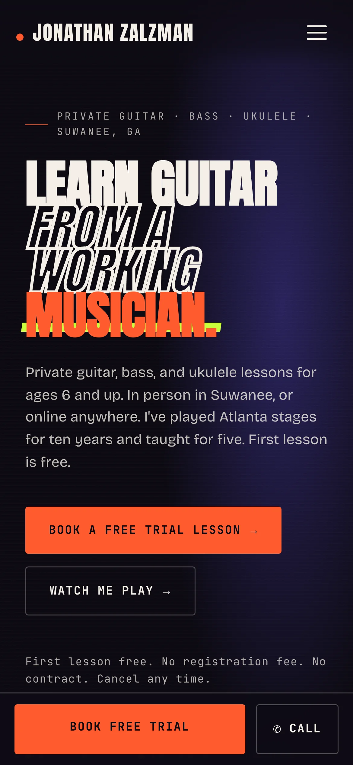
The headline still fills the screen, and the fixed bar keeps Book free trial and Call one tap away. 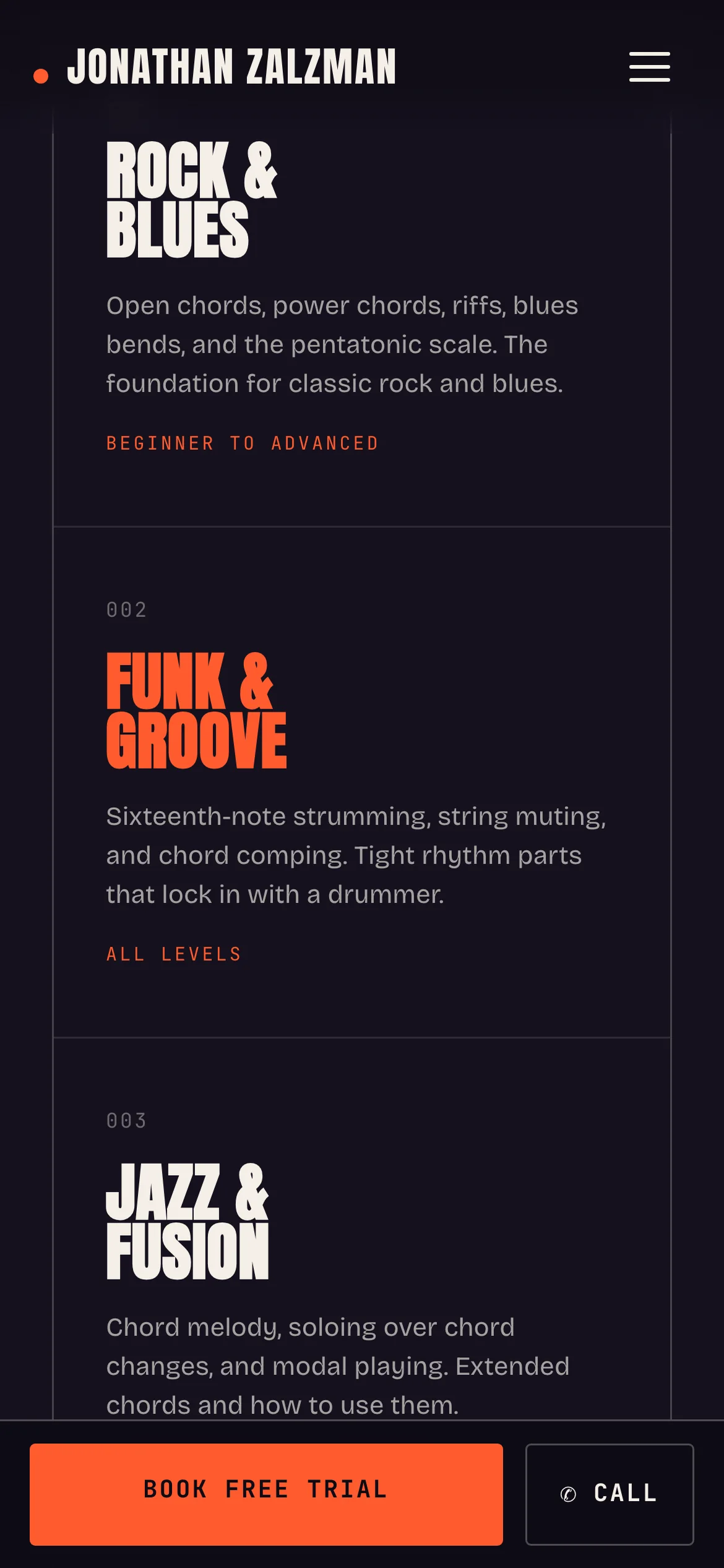
The three-by-three grid of styles becomes one column, each style keeping its own color. 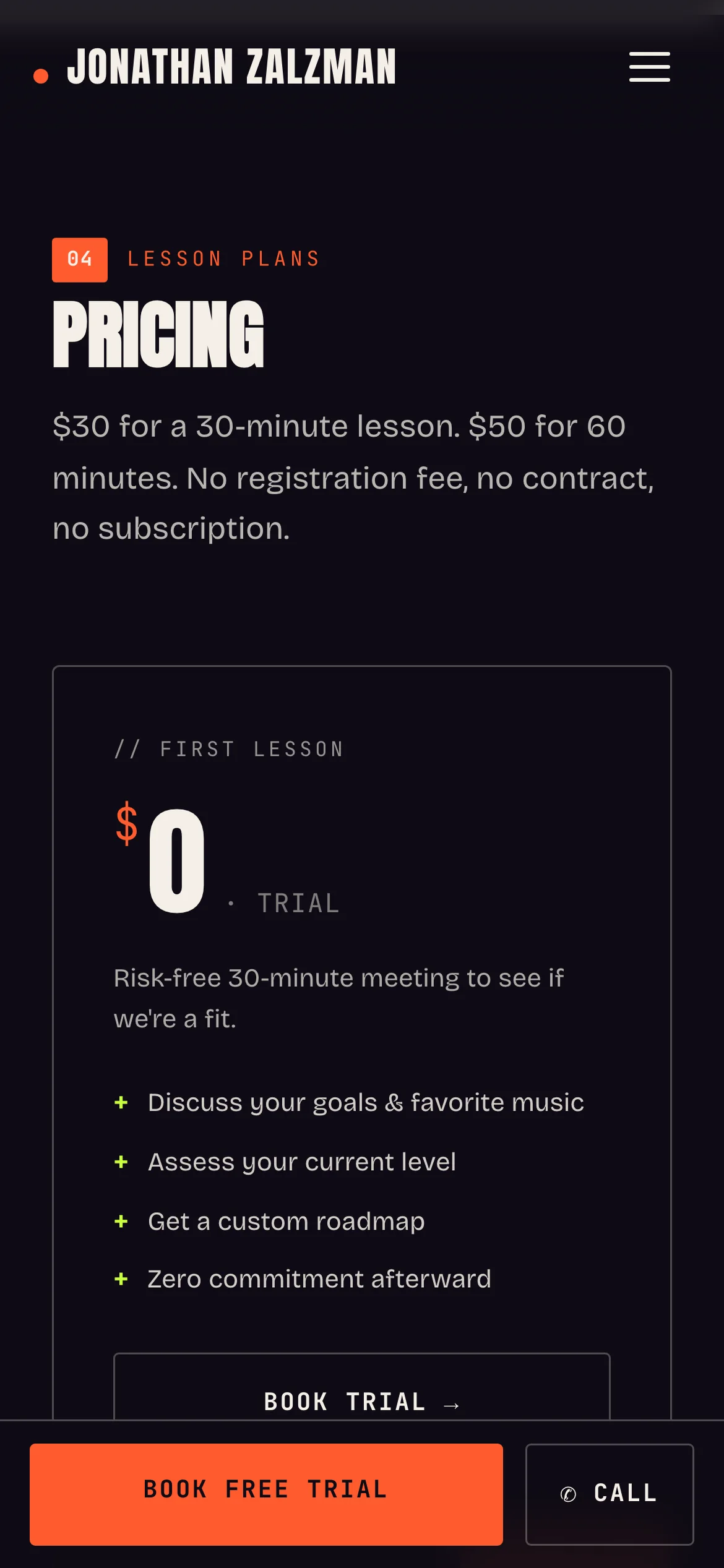
Pricing stacks, and the free first lesson comes first so the risk is gone before the prices appear. 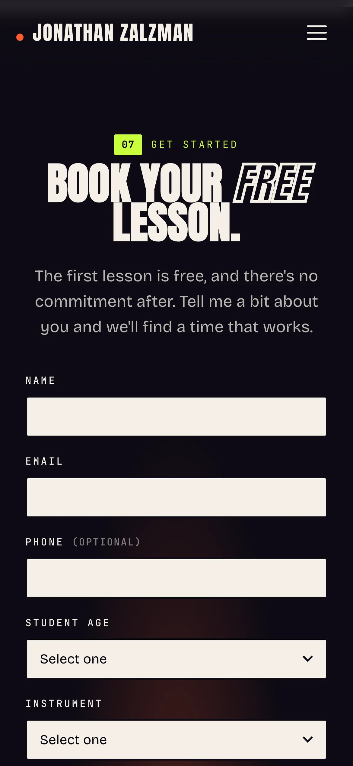
The booking form at phone width, one field per line, with the bar still sitting at the bottom.
What went into it
Design
- Dark background, orange accent and condensed display type, so the site looks like a musician's site.
- His own performance photos in every section, with no stock photos.
- Proof sits between the price and the form: student reviews, then the band section, then the questions people ask.
- The trial lesson button is in the header, the hero, after the styles, after pricing and at the end. On phones it sits in a bar at the bottom of the screen.
Build
- Hand-coded HTML, CSS and JavaScript. No framework, no page builder, no plugins.
- The credentials ticker, the pulsing trial button and the rise-in on the hero are CSS animations. The whole page is about 75 KB of HTML.
- The booking form runs on Netlify Forms with a honeypot field. It asks for the student's age, instrument, experience, in-person or online, the plan, best times and goals.
- On phones, a fixed bar at the bottom keeps Book free trial and Call one tap away the whole way down.
- Hosted free on Netlify.
Tools used
- HTML & CSS
- JavaScript
- Netlify
- Netlify Forms
- Figma
- Photoshop