Landing page
Wasatch Ridge Capital
A page about money that invents its numbers has to say so beside each block of numbers, and the footer alone is not enough. It still has to make seven kinds of figure readable on a phone. I designed and built this concept in 2026 to work on both at once. Wasatch Ridge is an invented firm and none of the figures are real.
- Client
- Wasatch Ridge Capital (an invented firm)
- My role
- Design and front-end development
- Year
- 2026
- Format
- One-page site
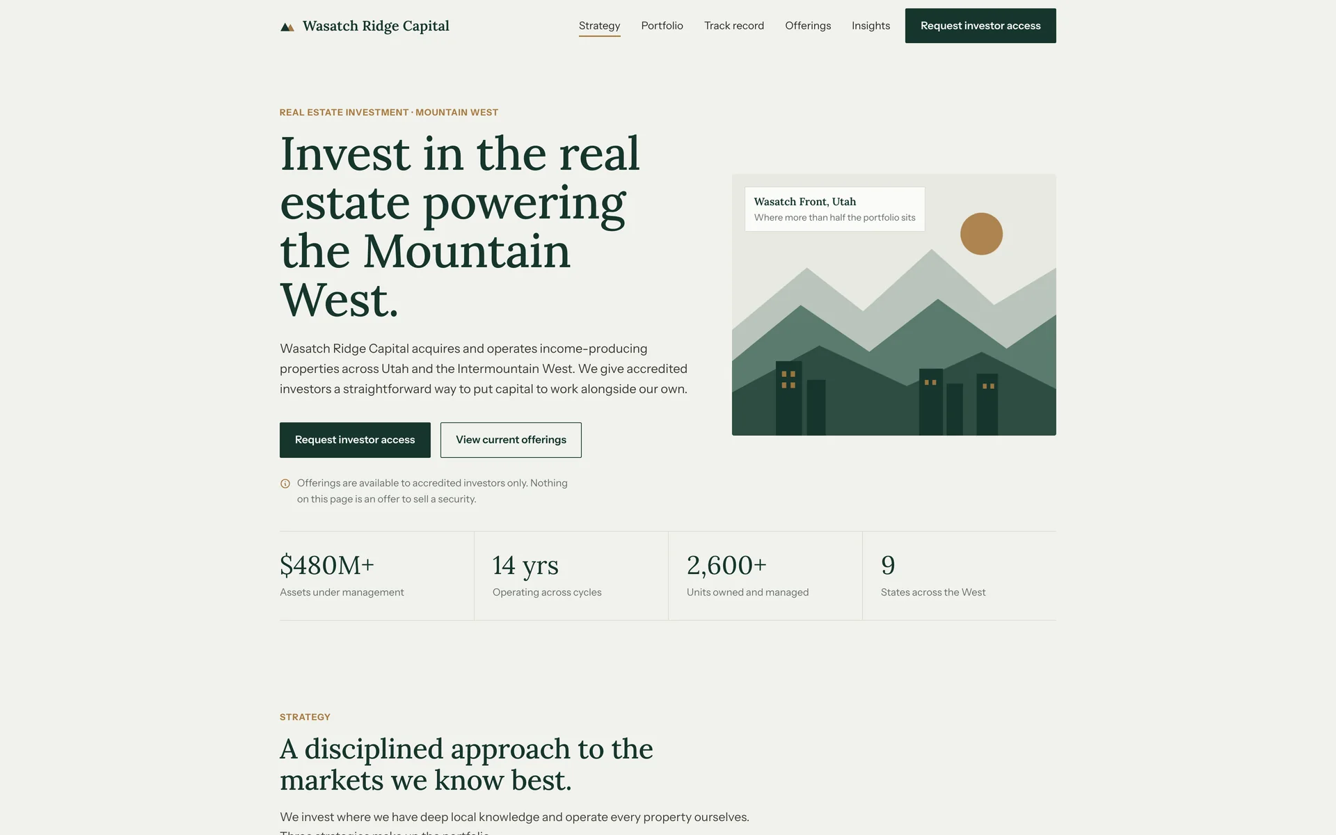
- Labeled throughoutEvery figure, property and offering is marked illustrative, with a concept notice in four places
- Filterable portfolioSix properties by type, each with units, year acquired and occupancy
- One HTML fileAbout 52 KB, hand-written, no framework and no build step
About the project
The page answers four questions in order: what the firm buys, whether it has done it before, what is open now, and what happens after you submit your details. The request form sits at the end, after all four are answered.
Disclosure was the main constraint. Every figure on the page is invented, so the page states that clearly and repeatedly: a concept notice under the portfolio, under the offerings, in the footer and on the form. The chart caption marks the figures illustrative, and the returns figure carries an asterisk that resolves in the footer. Nothing on the page can be read as a solicitation.
Wasatch Ridge is not a real firm. I invented it for the constraints: dense figures that still have to scan on a phone, a portfolio filter built without a framework, and a form serious enough for the amount it asks about.
Section by section
The page, top to bottom.
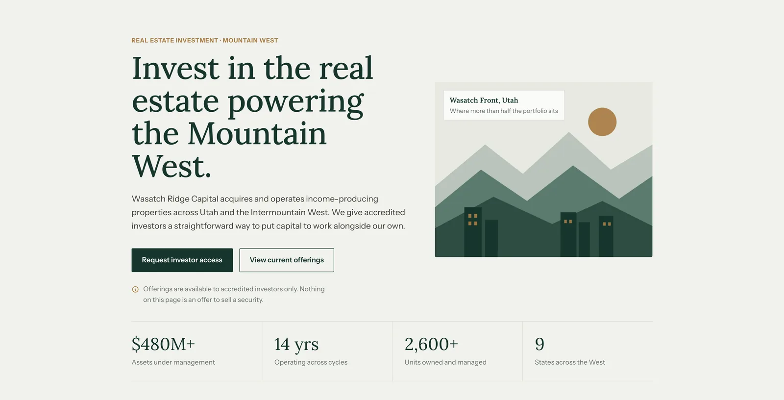
Header and heroThe headline states what the firm does and where it operates. The illustration is drawn in SVG, so it loads instantly and avoids the stock skyline photograph. The accredited-investor notice sits above the fold, and four figures close the section. 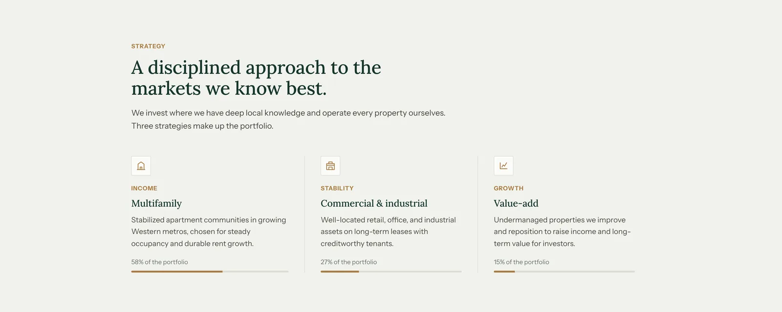
StrategyThree strategies, each with a one-line rationale and a bar showing its share of the portfolio: 58 percent multifamily, 27 percent commercial and industrial, 15 percent value-add. The bars let a reader check the allocation. 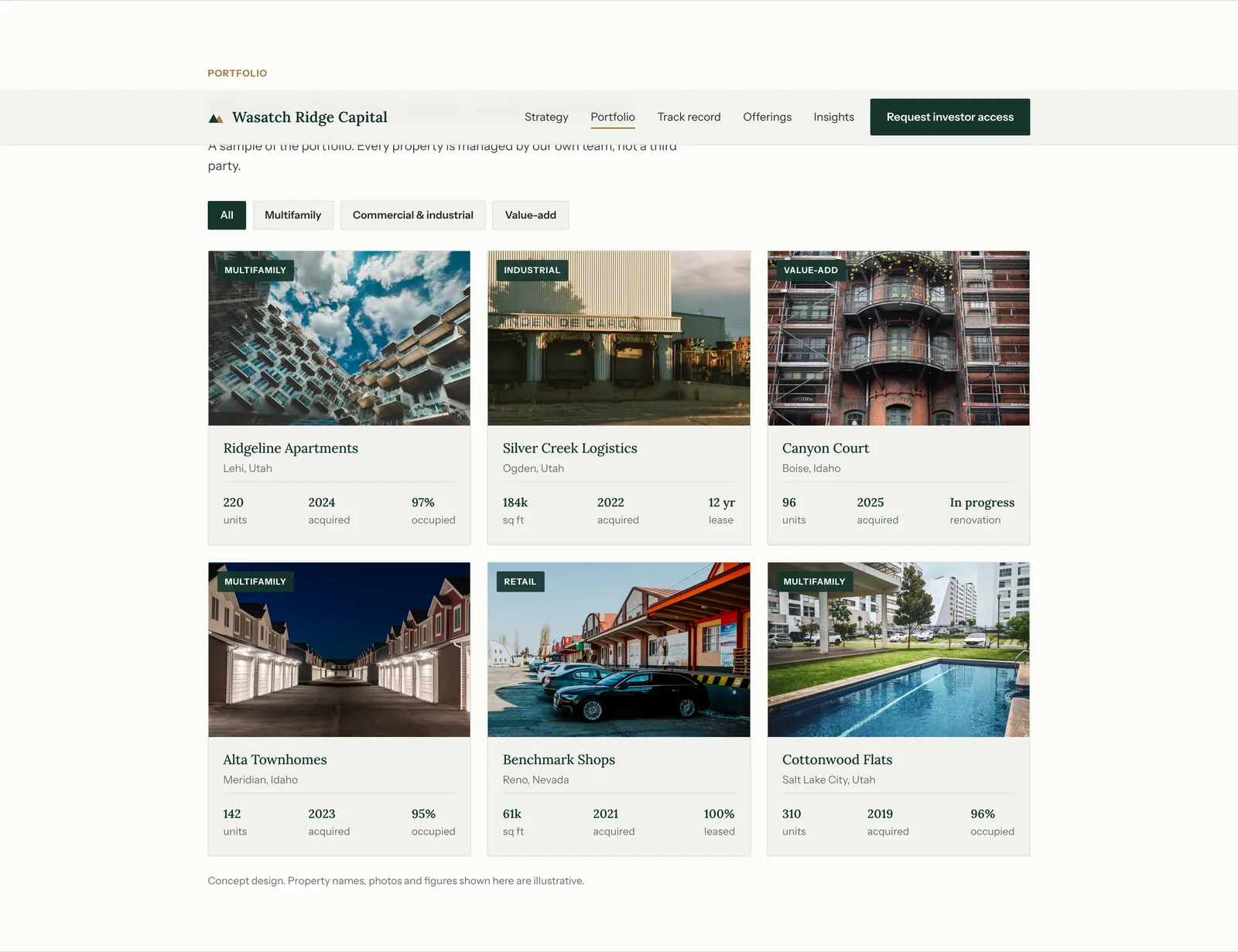
PortfolioSix properties, filterable by type without a page reload. Each card carries the numbers that matter for that asset class: units or square feet, the year acquired, and occupancy or lease term. The concept notice sits directly under the grid. 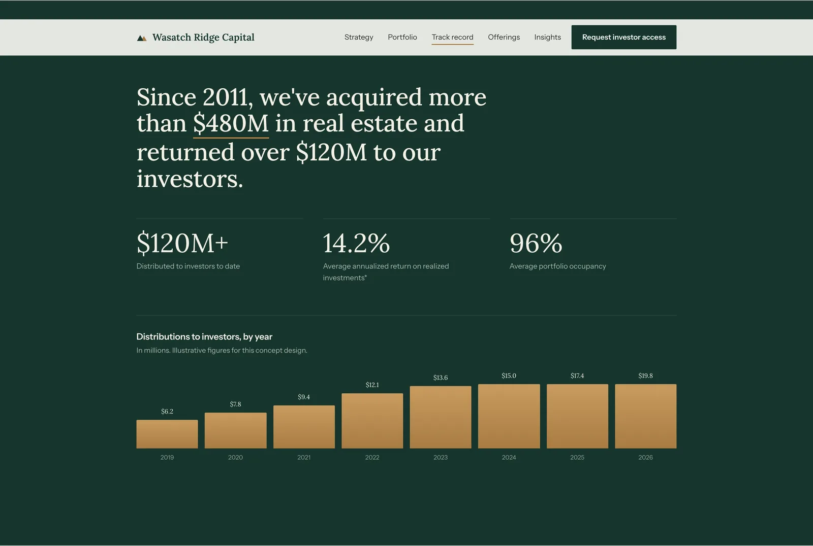
Track recordThe only section in the firm's dark green, which marks it as the center of the page. Three headline figures, then distributions by year as a bar chart built in CSS, so it stays sharp at any size. The caption marks the figures illustrative and the returns figure carries an asterisk. 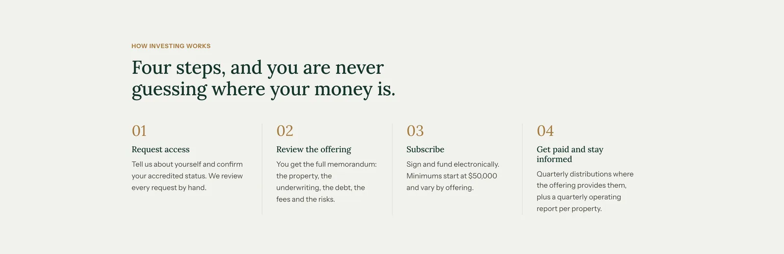
How investing worksFour numbered steps from request to distribution, in plain language. It answers what happens after a visitor submits their details, which the form itself does not explain. 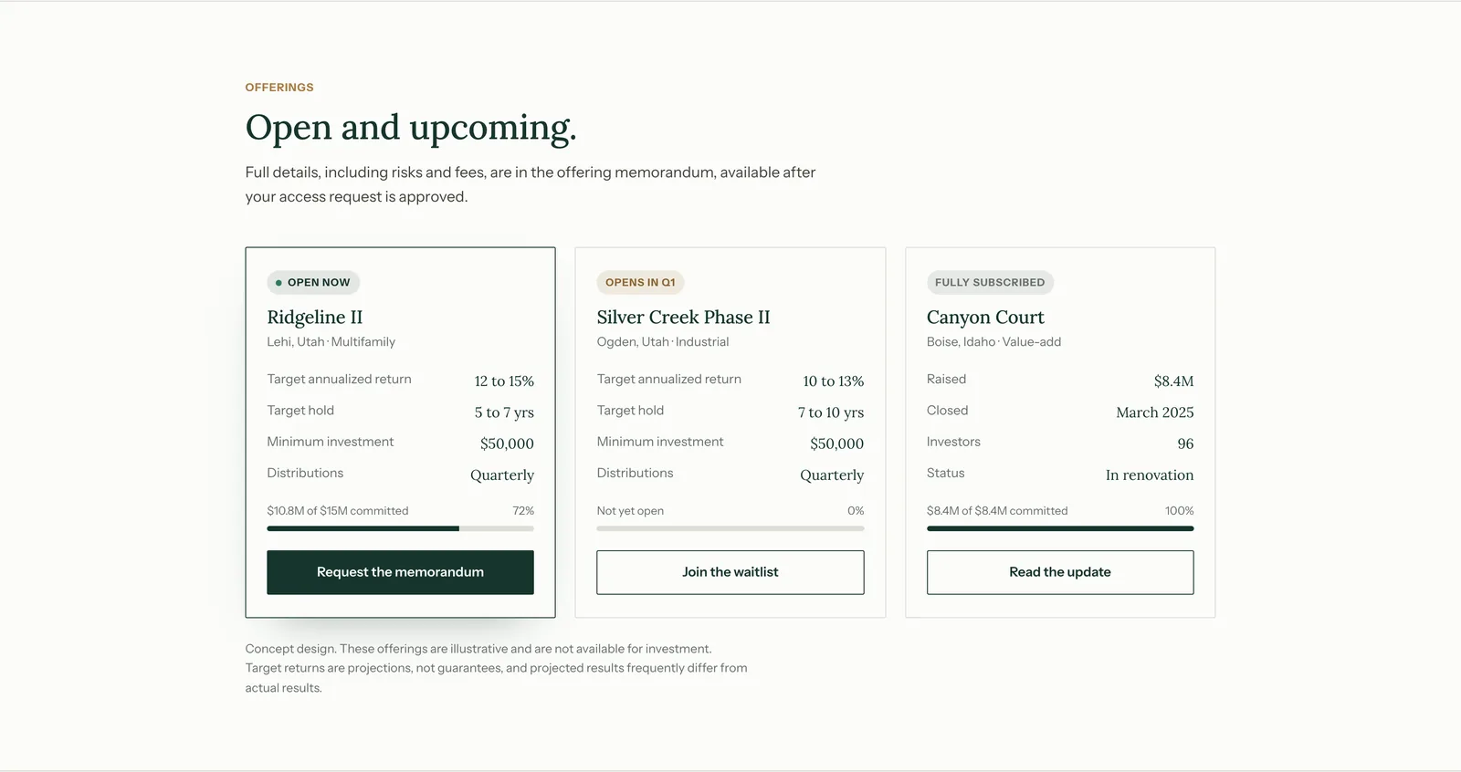
OfferingsThree offerings with status on each card: open now, opening next quarter, and fully subscribed. Each shows target return, hold period, minimum investment and the share of the raise committed. The fully subscribed offering stays on the page as evidence of completed deals. 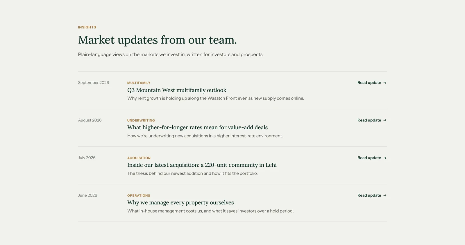
InsightsFour articles written for investors, each tagged by the part of the business it covers. 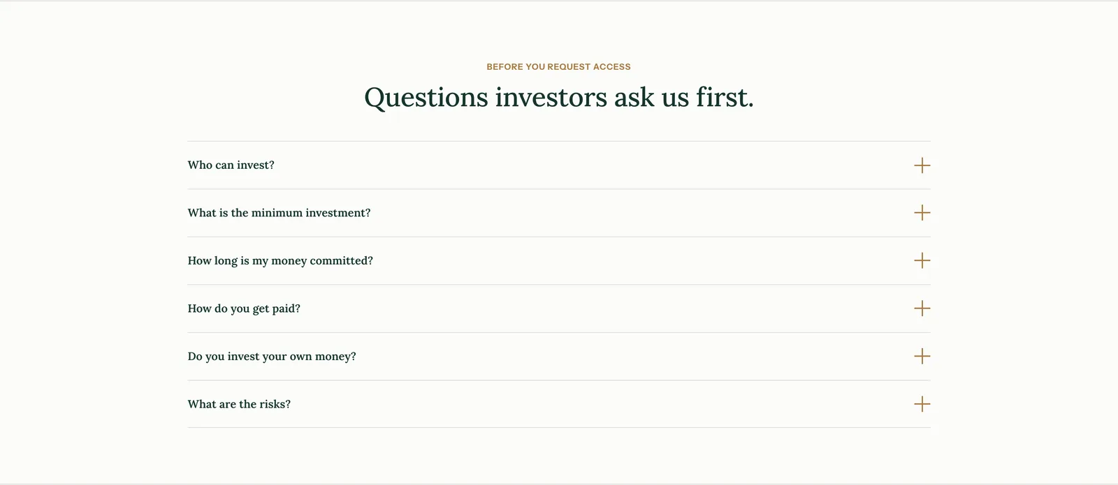
Before you request accessSix questions in an accordion, including the difficult ones: how long capital is committed, whether the firm invests alongside its investors, and what the risks are. 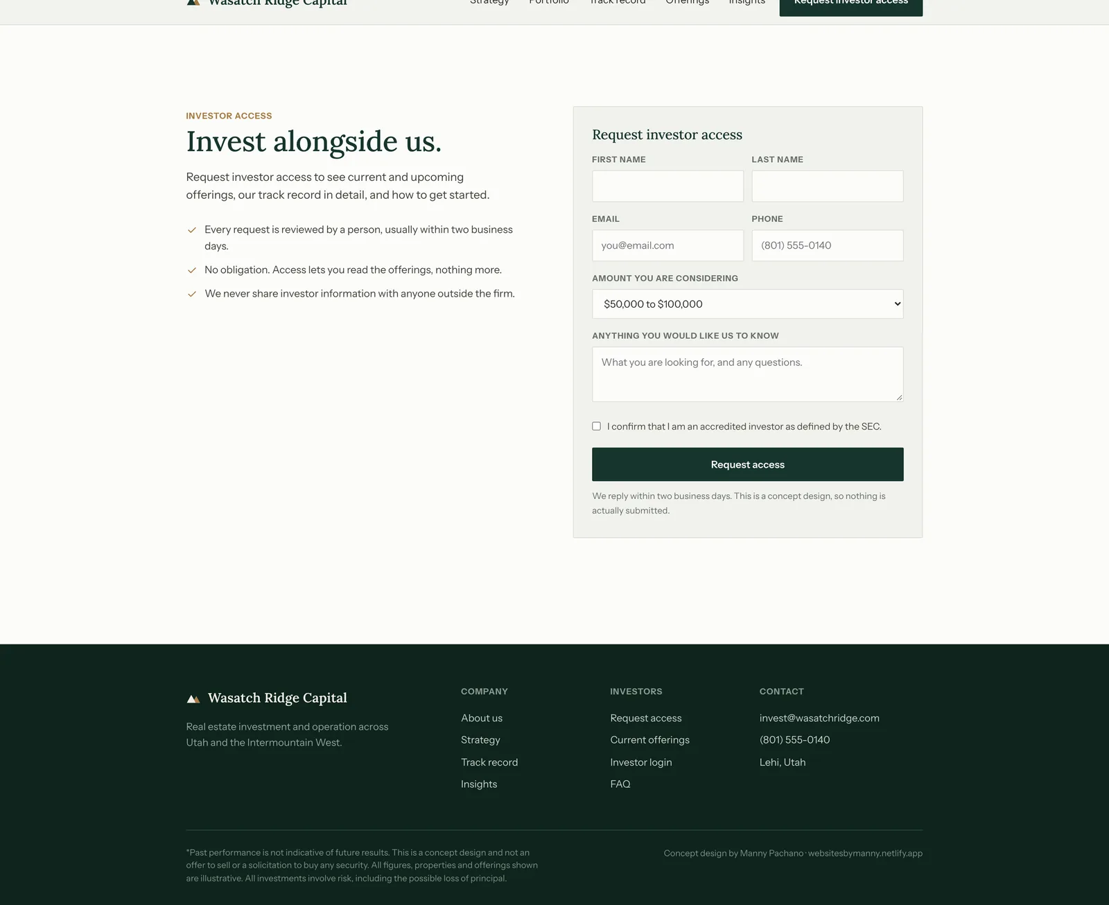
Investor access and footerThe request form: name, email, phone, investment amount as a range, a free-text field and an accredited-investor confirmation. Three reassurances sit beside it, and the footer carries the full disclaimer.
The process document
A second document at /process shows how the page was made: the brief, the reading order, the wireframe beside the finished build, the decisions and the component system. The finished page runs live inside the document.
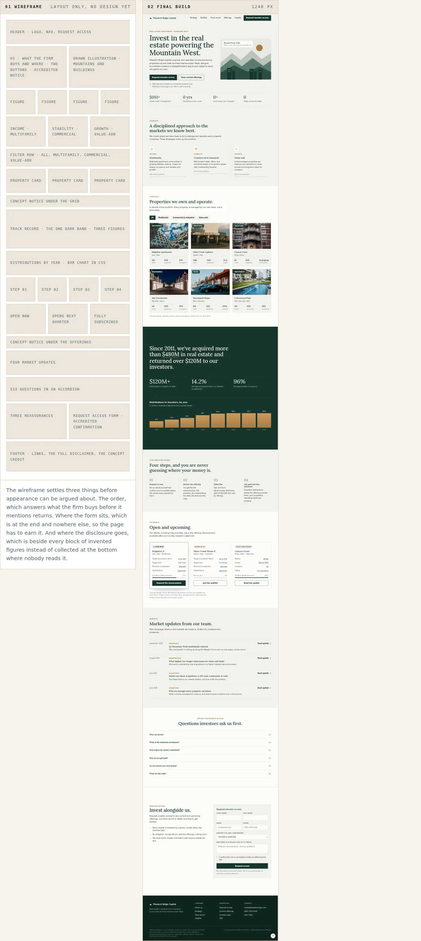
The wireframe on the left and the finished page on the right, running live in the document at 1240 pixels. 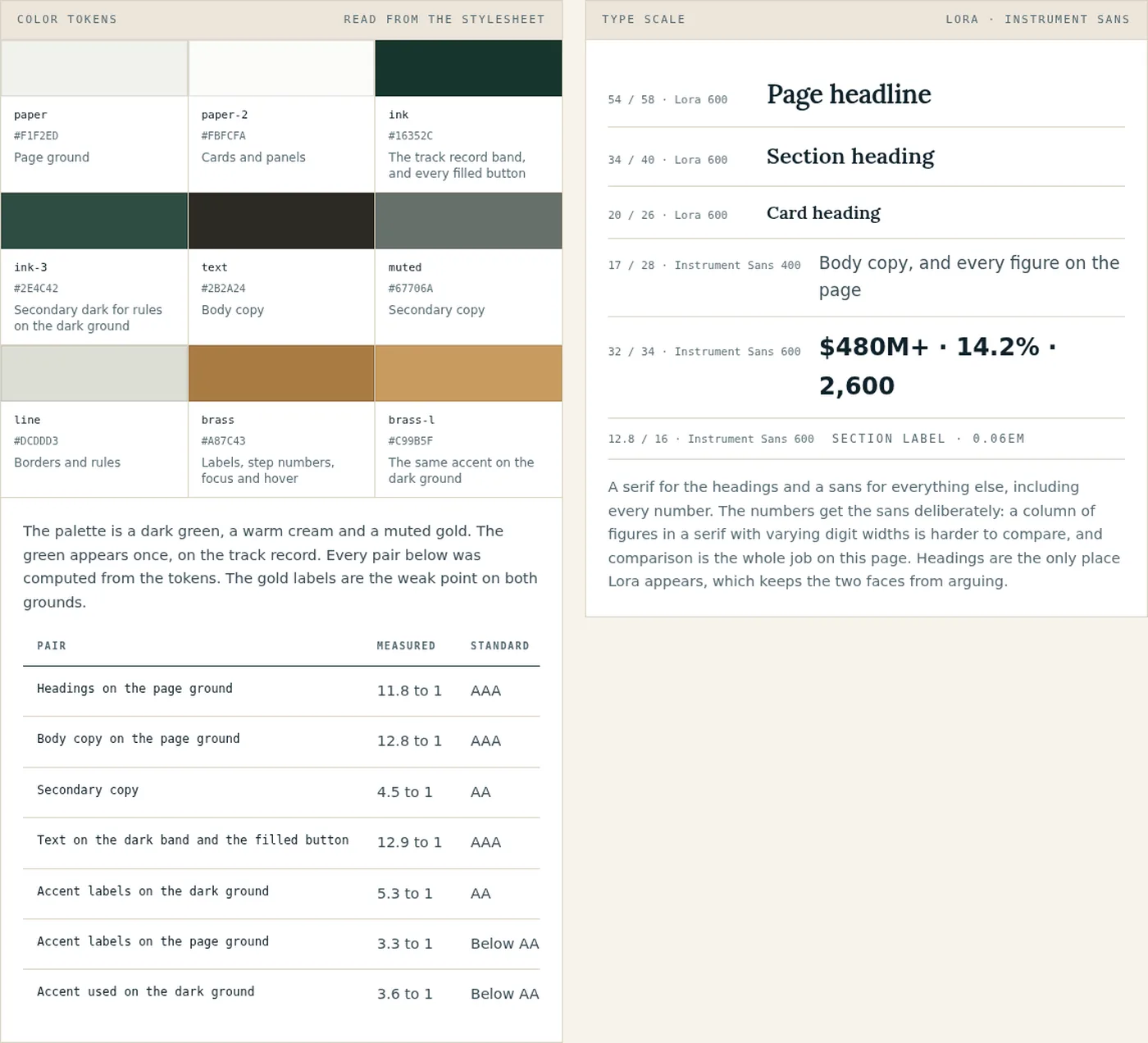
The swatches and the contrast table are read out of the page stylesheet when the document is built. The gold labels are the weak point, measuring 3.32 to 1 on the cream and 3.56 on the dark green, where small text needs 4.5. 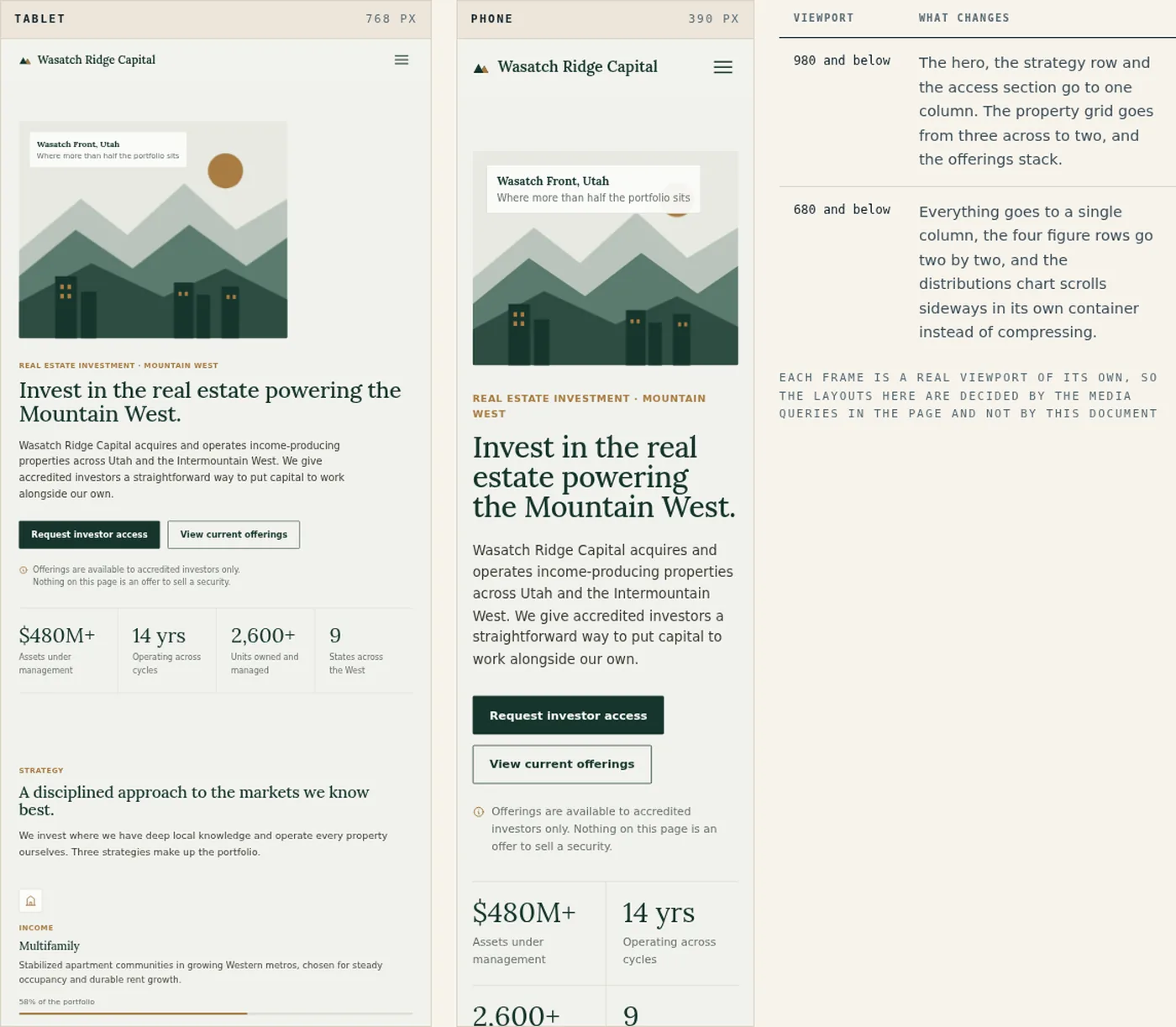
Both frames show the live page at its own width. The table lists the two breakpoints in the stylesheet.
On a phone
The page on a phone. The figures are the hardest part to keep readable at this width, so they were designed first.
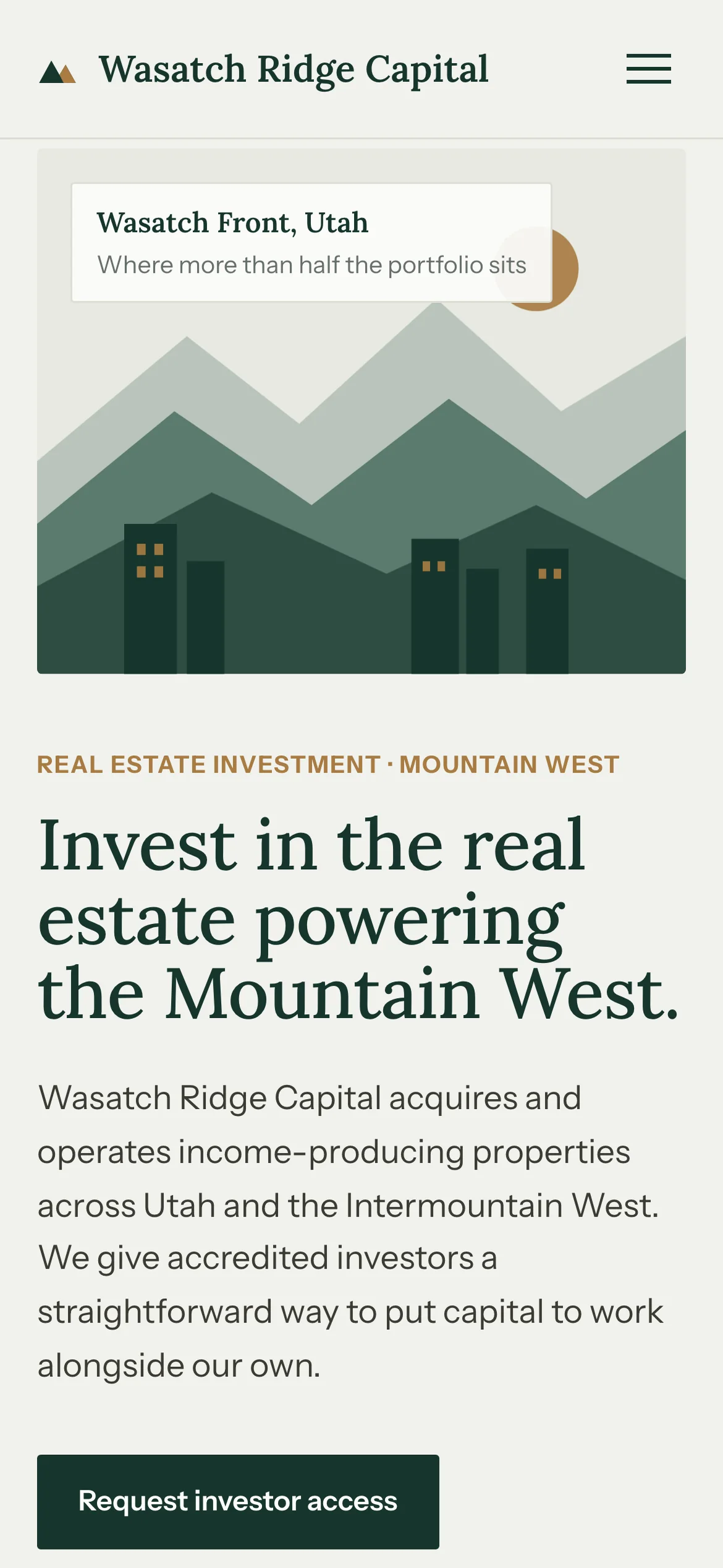
The illustration moves above the headline and the single button fills the width. 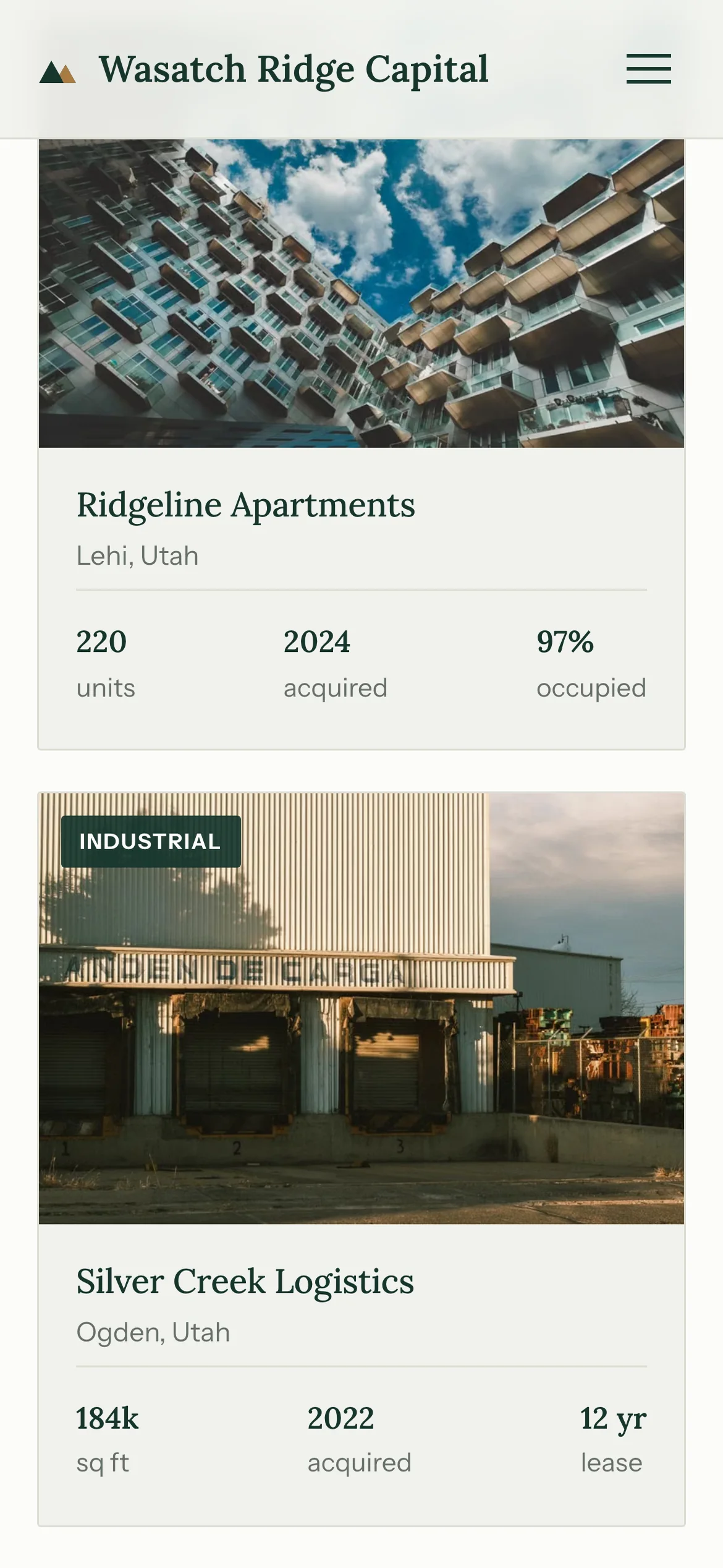
Property cards stack one per screen, and the three figures stay in a row. 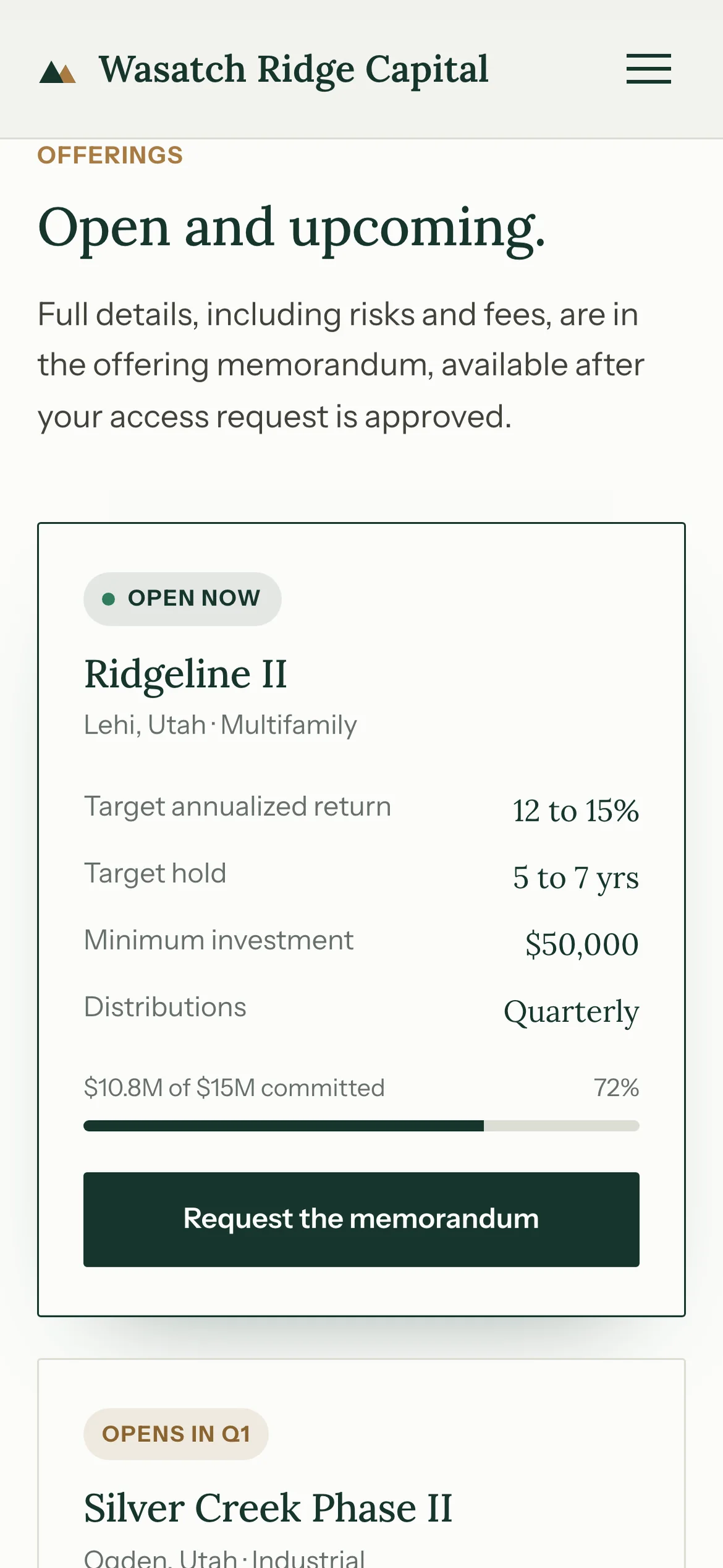
Each offering becomes a full-width card with its status badge and the committed bar intact. 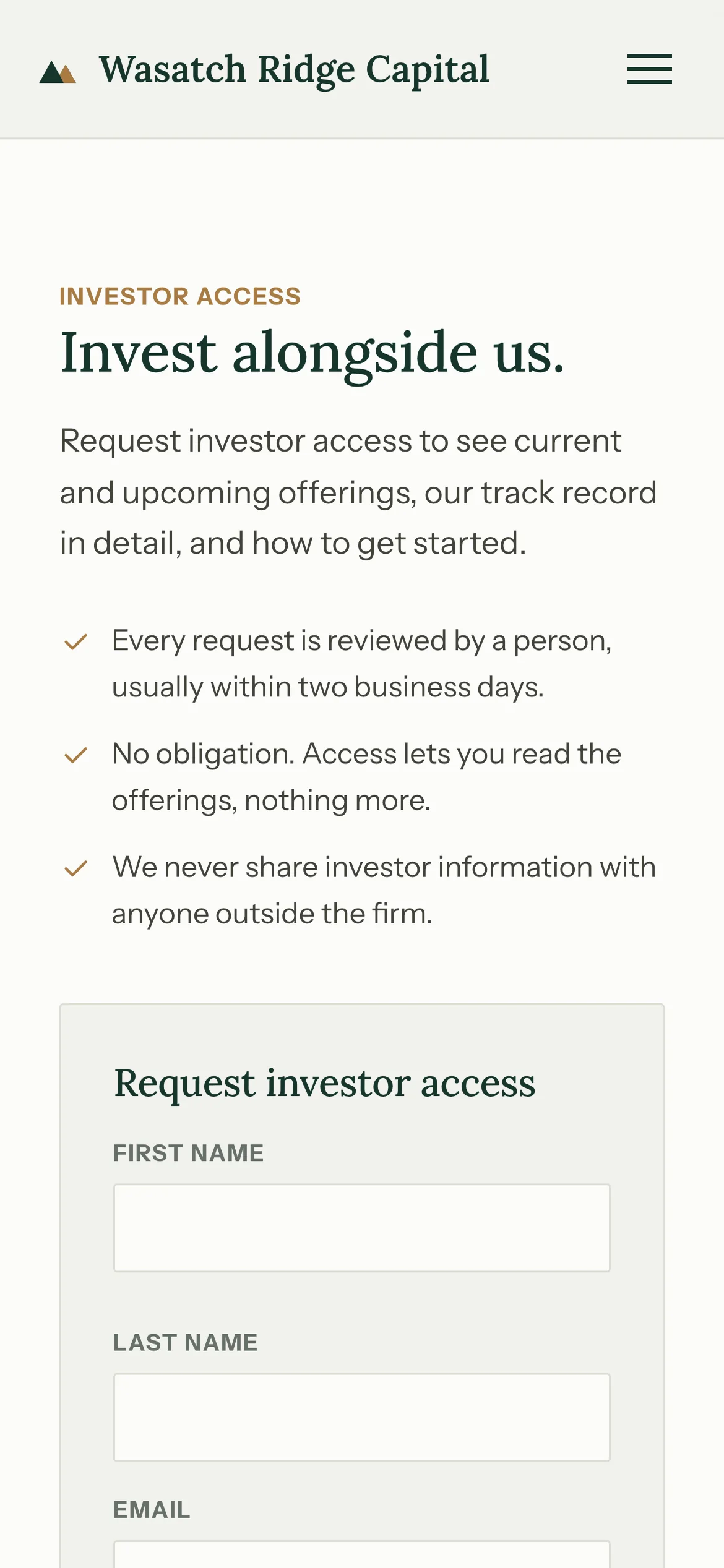
The three reassurances move above the form.
What went into it
Design
- Two typefaces: Lora for headlines, Instrument Sans for text and every figure. Numbers get the sans so columns of them line up.
- Dark green, cream and muted gold. The green appears once, on the track record, which marks it as the center of the page.
- The hero illustration is drawn, which avoids the stock skyline photograph most firms in this sector use.
- Figures are grouped in rows of three or four and never mixed with body copy, so a reader can scan the numbers without reading the page.
- Disclosure is built into the layout: the concept notice appears in four places, and the chart, the offerings and the returns figure each carry their own label.
Build
- One HTML file, about 52 KB, with hand-written CSS and JavaScript. No framework and no build step.
- The portfolio filters on a data attribute and updates aria-pressed on the buttons, so the filter state is exposed to screen readers.
- The distributions chart is CSS, with each bar height set by a custom property. It stays sharp at any size and is hidden from screen readers, which get the same figures as text above it.
- Ten numbers count up when their block comes into view, on IntersectionObserver, and hold their final value for anyone who prefers reduced motion.
- The FAQ uses native details elements, so it works before the JavaScript runs.
- Two breakpoints, 980 and 680 pixels. Deployed on Netlify.
Tools used
- HTML & CSS
- JavaScript
- SVG
- Google Fonts
- Netlify